DESIGN MOVEMENTS
GrapusGrapus design collective was founded in 1970 by artist members of the French Communist Party (PCF), Pierre Bernard, Gerard Paris-Clavel and Francois Miehe, who had collaborated during the May 1968 student movement. They were joined in 1974-5 by Jean-Paul Bachollet and Alex Jordan. However Miehe left the group in 1978. In the beginning, by producing cultural and political posters for experimental theatre groups, progressive town councils, the PCF, the CGT (Communist trade union), educational causes and social institutions, Grapus sought to 'change life' by the twine dynamics of graphic arts and political action. The collective scorned the commercial advertising, and adhering to its founders idealistic principles, tried to bring culture to politics, and politics to culture. The Grapus visual communication style was powerful and highly distinctive, characterized by an unpretentious and mercurial combination of impulsive scribble, flat colors, licentious compositions and exuberant rowdiness. In 1984, 1985 and 1988 Grapus designed the corporate identity of the Centre National des Arts Plastics, the Parc La Villette and the Louvre Museum respectively. From 1978 on, Grapus showed its work in major exhibitions at the Musee de l'Affiche in Paris, the Stedelijk Museum in Amsterdam, the Aspen Conference in Aspen, Colorado, and the Museum of Contemporary Art in Montreal. All in all, they were one of the most recognized poster designers of their era, and have influenced generations of designers since.
|

The Raymond Loewy poster above was one such cultural work, created for an exposition in Paris featuring Loewy’s drawings. It’s a beautiful 4-color silkscreen, and measures around 27“x41”.
|
The Modern Movement in America
The Armory show in New York, held in 1913, was the first opportunity for Americans to see the new art that had been developing in Europe. Work by the Impressionists, Post Impressionists, Matisse, and Picasso were included in this exhibition. Until World War II the important American galleries exhibited only the work of European artists. American artists were simply not taken seriously; it was believed that one had to go to Europe to be a real artist. Those American artists that didn't go to Paris turned inward, creating work mainly for themselves and each other. The trend in the years between World WarI and World War II was toward the development of private styles. Artists came to have contempt for a public that had contempt for them; they gave up on the idea of communicating to a broad audience. At the same time they studied avidly the philosophers of modernism. They read the writings of surrealist intellectuals such as Andre Breton, and Abstract painter Wassily Kandinsky's tract on abstraction Concerning the Spiritual in Art . They took these philosophies to heart, especially the ideas of Surrealism. As the Nazis drove dissenters out of Europe, many artists fled to the US. This exodus (which also included leading Surrealists and others) contributed to the development of the first indigenous American Art movement, Abstract Expressionism . The result was the development of private styles, based in the subconscious, and reached through dreams, mythic images, and reinforced by imagery drawn from archaeology, primitive art, mysterious ancient inscriptions, and the like. Willem de Kooning and Jackson Pollock were the leaders of this new American movement. Out of the extremely varied work of the Abstract expressionists there developed a group of artists working in quite diverse styles, which became known as the New York School. This group included Rothko, Motherwell, Gottlieb, Morris Lewis, Jasper Johns, and others.
The International StyleThe International style was born in western Europe in the 1920s from the precedent breaking work of noted architects Le Corbusier in France, and Walter Gropius and Mies van der Rohe in Germany. Striving to create a new modern form and functional theory of architecture, these architects abandoned tradition to create a pared down, unornamented style that emphasized geometric shapes, viewing it as architecture for the modern age. Utilizing new construction techniques and materials, buildings of the International style were starkly different than those of previous eras in not just appearance. Flat roofed, asymmetrical and with bands of windows set into a rectangular form, International style buildings were a dramatic departure from past eras. Many European architects came to the United States in the period preceding World War II, bringing their new ideas about modern design with them. In the 1930s American architects began experimenting with the International style, building upon the early 20th century American trends like the Commercial, Bungalow and Prairie styles, and the development of skyscrapers.
|
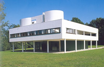
Le Corbusier created the building, in Poissy France, between 1928 and 1929. An early and classic exemplar of the "International Style", which hovers above a grass plane on thin concrete pilotti, with strip windows, and a flat roof with a deck area, ramp, and a few contained touches of curvaceous walls.
|
FINE ART MOVEMENTS
Op Art
Op art is a term used to refer to a style of nonobjective art in which optical effects of color relationships and formal relationships are the primary subject matter. These works are characterized by intricate, usually geometric patterns and carefully calibrated colors. Among the artists known for this style are Bridget Riley and Vasareley. This very intellectual approach shows a relationship with the earlier de Stijl ideas about the aesthetics and expressive power of pure form and color.
Pop Art
Pop art is an art form based in the power of popular images, derived from the commercial and mass media sources that permeate modern American society. By elevating the banal to the status of Art, the viewer is challenged to reconsider the nature of society and its values. Andy Warhol's soup cans, coke bottles, and movie stars are the best known examples. Roy Lichtenstein uses comic book imagery and style, creating bold images that are undeniably part of the American lexicon. Artists such as Claes Oldenburg focus our attention on everyday objects by blowing them up to enormous size.
Action Painting
Action Painting emphasizes the process of making art, often through a variety of techniques that include dripping, dabbing, smearing, and even flinging paint on to the surface of the canvas. These energetic techniques depend on broad gestures directed by the artist's sense of control interacting with chance or random occurrences. For this reason, Action Painting is also referred to as Gestural Abstraction. The artists and the various techniques are associated with the movement Abstract Expressionism and The New York School of the late 1940s, 1950s and 1960s (for example, Jackson Pollock, Willem de Kooning and Franz Kline). The term "action painting" was invented by the critic Harold Rosenberg and appeared for the first time in his article "American Action Painters" (ArtNews, December 1952). In France, action painting and Abstract Expressionism are called Tachisme (Tachism).
Urban Graffiti
Depending on how you define it, the history of graffiti can go as far back as the cavemen writing petroglyphs in caves. The modern concept of graffiti, spray painting on public properties, broke onto the scene in the late 1960s on the subway cars of New York City. The subculture of modern graffiti was born out of the ‘style wars’ of the 1970s, The Golden Era. Artists wanted to out do each other with bigger and better tags on the sides of buildings, expanding from the subway car, though the subway car was still a major blank canvas. Spray paint cans replaced black markers and artists met to go over sketches to approve or disapprove of others work. During this time the practice spread outside of New York City across the country.
Graffiti influences mainstream graphic art in so many ways. From comic strips, to branding, to clothing to magazines, to typography, it has had a major impact. One major reason for this is maybe the hip factor and subculture that comes along with graffiti. Young people find graffiti visually pleasing and since they are the clients for many products today graffiti has taken the front of the line when it comes to graphic design. Many famous companies including Pepsi, Sony and Nike have used graffiti for their marketing. It is hard to grab the attention of young people and since they find graffiti so influential and 'hip' it has become a part of graphic design on the whole.
Graffiti influences mainstream graphic art in so many ways. From comic strips, to branding, to clothing to magazines, to typography, it has had a major impact. One major reason for this is maybe the hip factor and subculture that comes along with graffiti. Young people find graffiti visually pleasing and since they are the clients for many products today graffiti has taken the front of the line when it comes to graphic design. Many famous companies including Pepsi, Sony and Nike have used graffiti for their marketing. It is hard to grab the attention of young people and since they find graffiti so influential and 'hip' it has become a part of graphic design on the whole.
THE ARTISTS
JACKSON POLLOCK
Pollock had created his first "drip" painting in 1947, the product of a radical new approach to paint handling. With Autumn Rhythm, made in October of 1950, the artist is at the height of his powers. In this nonrepresentational picture, thinned paint was applied to unprimed, unstretched canvas that lay flat on the floor rather than propped on an easel. Poured, dripped, dribbled, scumbled, flicked, and splattered, the pigment was applied in the most unorthodox means. The artist also used sticks, trowels, knives, in short, anything but the traditional painter's implements, to build up dense, lyrical compositions comprised of intricate skeins of line. There's no central point of focus, no hierarchy of elements in this allover composition in which every bit of the surface is equally significant. The artist worked with the canvas flat on the floor, constantly moving all around it while applying the paint and working from all four sides.

ROY LICHTENSTEIN
'Whaam!' is based on an image from 'All American Men of War' published by DC comics in 1962. Throughout the 1960s, Lichtenstein frequently drew on commercial art sources such as comic images or advertisements, attracted by the way highly emotional subject matter could be depicted using detached techniques. Transferring this to a painting context, Lichtenstein could present powerfully charged scenes in an impersonal manner, leaving the viewer to decipher meanings for themselves. Although he was careful to retain the character of his source, Lichtenstein also explored the formal qualities of commercial imagery and techniques. In these works as in 'Whaam!', he adapted and developed the original composition to produce an intensely stylised painting.

ANGUS MCBEAN
Although McBean’s photographic career started in the 1930's it was only after Work War II that he became the most prominent theatre photographer in Great Britain. His light hearted portraits often contained an element of surrealism. In the 1950's and 1960's he started to take photographs for album covers, arguably the most famous being the Beatles leaning over a balcony.

|

|
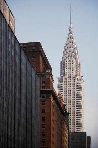
WILLIAM VAN ALEN
The Chrysler Building in New York City was completed in 1930. For a few months, this Art Deco skyscraper was the tallest structure in the world. It was also one of the first buildings composed of stainless steel over a large exposed surface. The architect, William Van Alen, drew inspiration from machine technology for the ornamental details on the Chrysler Building. There are eagle hood ornaments, hubcaps, and abstract images of cars.
|

|
DONALD JOSEPH WHITE, "DONDI"
Graffiti became a serious part of Dondi's life in the mid 1970s. He tagged using “NACO” and “DONDI”, and worked on refining his style, gradually moving from simple tagging to building more elaborate pieces. His most famous work was Children of the Grave Parts 1, 2 and 3—three whole cars on the New York subway in the years 1978–1980. The name of the piece was taken from a Black Sabbath song. Journalist Martha Cooper filmed the final piece from start to finish. On this last piece, Dondi adopted the cartoon characters from the late Vaughn Bode. It was a dream-come-true for Dondi, who was building his reputation as a graffiti writer. Dondi was the first graffiti artist to have a one-man show in the Netherlands and Germany, and his work is collected by European museums.

